Tuesday, December 14, 2010

Another Visit to Williams College: This time to see rare photographs


Last week my visual studies class went to Williams College Museum of Art again. This time we got the unique opportunity to look at some of their rare photographs. John Stomberg gave us a great lecture about the history of photography and digital versus analog film. He also took us throught some of the current exhibitions and showed us photographs of note. We saw so many photographs and talked about so much it's hard to discuss it all. Instead I'm going to focus on a few specific pieces that deal with manipulation in photography.

The first piece we talked about was Oppenheimer's Garden by Robert Parke-Harrison. He used analog film, but put the final photograph together by cutting and pasting paper negatives together. It was printed over a wash, then covered with a layer of bees wax. This process gives the image a dream-like quality. It was created using all old techniques in protest agains the new photography medium, digital.

The second piece we talked about was part of a series called Fictitious Portraits by Keith Cottingham. It was the first time an artist had used photoshop with a Mac to create an image. The artist made sculptures of faces, took photographs, and then used them as a base to create the faces of the boys. These images, thought not taken with a camera, are considered photographs because they're printed on digital photo paper.

This image caused a great uproar in the photography community. It was argued that people couldn't trust photographs to show what was real; you could erase what was human and create it on a computer. The photo, according to critics, was commenting on cloning and creating a "master" or "perfect" race. The photographs came out around the same time the first sheep was cloned and digital was still relatively new. There were numerous conventions where some artists walked out. It was clear that photography had to be redefined. One of the arguments for digital was that it was simply a new way to take a look at photographs. Even with traditional media artists had been manipulating images of "reality", as is shown by Oppenheimer's Garden. Now digital is not so contravertial. In fact, it's what most photographers use. Some use it without manipulation, as simply a different form than analog, others manipulate heavily. The photography controversy reminded me of the great uproar that was raised with the impressionists. Painting up until that point had become focused on making images look as realistic as possible. Impressionists ignored that rule and tried to capute the light instead of making the images look perfectly real.

Up until this trip I had reservations about digital photography myself. This was partly due to starting my photo education with analog film, and partly because I felt manipulating the image on the computer was "cheating". But this trip opened my eyes to why digital is now considered a legitimate form of photography. It's still art. Photography isn't necessarily just about capturing reality; it can be about creating something new from reality.

Wednesday, December 1, 2010

Tara McPherson Paintings


All these paintings are by Tara McPherson and were part of her show at the Jonathan Levine Gallery. To learn more, check out my post below. The titles are, from top to bottom: The Love Space Gives Is as Deep as the Oceans, The Umibozu Wish, The Snow Bride, and Dark Matter Witch. Enjoy!

Trip to Chelsea in NYC: Focus on Jonathan LeVine Gallery

A couple weeks ago my Visual Studies class took a trip to New York City to visit the galleries in Chelsea. It was one of those experiences you won’t forget. We did a whirl wind tour of 11 galleries (maybe more) and absorbed contemporary sculpture, painting, photography and digital art. We saw so many shows with so many pieces I liked that it’s hard to pick just one. I think I’ll focus on an exhibition I saw at the Jonathan LeVine Gallery. It was a series of pieces by illustrator Tara McPherson called “Bunny in the Moon”.

McPherson is a painter, poster artist, and freelance illustrator based in New York City. Since I’m considering being an illustrator for my career, it was great to see one that was shown in a gallery. She has created comic art, covers, ads and editorial illustration for DC Comics, Dark Horse Comics, Warner Brothers and many more. She’s also done gig posters for well known music groups like Beck and Death Cab for Cutie.

The “Bunny in the Moon” exhibition contains paintings on linen, drawings and soft sculpture. The unifying theme of the show is the creative interpretation of mythology from different cultures around the world. It deals with themes equating love and loss to the ultimate life sacrifice and death. The piece that shares the name of the show is based off the story of a Buddhist deity taking the form of a poor starving man and going to all the animals for food. Since the rabbit has nothing to offer, he offers himself. To honor his sacrifice, the deity puts the rabbit’s image in the moon. Her piece links this story to sacrificing oneself for love in a relationship.

I liked all of the pieces in this show. Her style is clean and reflects her background as an illustrator. One can’t help but smile as they look at her work. You can’t help but see the stories too. You may not get the exact one she’s portraying, but you get a sense of something; someone’s journey or romance.

If you want to learn more about Tara McPherson or the Jonathan LeVine Gallery, check out these websites: www.jonathanlevinegallery.com or www.taramcpherson.com

Tuesday, November 30, 2010

Yes, I changed the background

Yeah, I did. I was a little bored with the other one, and it didn't seem to fit what I've been talking about either. Enjoy! :)

Thoughts on the Williams College Museum of Art's Exhibit "Posing Beauty in African American Culture"


A few weeks ago my Visual Studies class went to Williams College to see the Posing Beauty in African American Culture exhibit. Delila Scrugs, who helped put together the exhibit, gave us a great tour. The exhibit features photos from African American artists commenting on how beauty in viewed. There were many great photos and artists represented, but one series of photographs stood out to me.

There was a series of photographs by Sheila Pree Bright that made you look twice. At first glance it looked like a bunch of photographs of Barbie’s, but as you looked closer you realized that something wasn’t right. Parts of the Barbie’s were real. In one image the Barbie has a human eye and mouth that make her look skewed and almost deformed. The picture is asking you if it’s really worth it to put in so much to look so perfect. In this image the beauty looks wrong. Being a bit of a feminist, and not a huge fan of Barbie’s (yes, I owned two, but they went on adventures with dragon beanie babies and fought evil), I loved seeing how the real and the fake contrasted, but also worked together. Another is the back of a Barbie with real dreadlocks. You can see the label and you get the sense this represents people being labeled as well. One of the photographs is just of a Barbie, but she looks tired and old. Her eyes droop and she’s missing an earring. She also has one brown spot on her perfect skin. It’s almost like she’s tired of being perfectly beautiful, and doesn’t mind the blemishes and imperfections.

Unfortunately this show is no longer at Williams College, but it is traveling. I encourage you to look it up and see where it’s heading next. There’s also a book you can buy if you really like it.

Photographer Jason Houston Visits My School!

Picture 4.png

Several weeks ago photographer James Houston came to our school and gave apresentation about his photographs. He works with a wide range of subjects. He takes photos for organizations and magazines as a photo journalist and also works on his own projects. He’s been to Africa and Asia, but also photographs in Western Massachusetts documenting artists working in a wood fire kiln. He talked to us about where he’s been, how he takes his photos, and how he got into photography. I’m going to focus on one of his series “Dying Beautifully.”

“Dying Beautifully” is a series of photos taken of a close friend, Chet Cahill the day before and after he died of cancer. His wife Billie Best invited Houston to the house to take pictures to document the time. Most of the pictures were of Cahill in his hospital bed, or of his wife with him.

For me this was particularly moving because it reminded me of when my grandmother lived with my family when she was dying of colon cancer. Like Cahill, she was in my living room in a hospital bed. The pictures captured the mood of the time; quiet, sad, and contemplative. In the images of just Cahill in his bed reminded me of how my grandmother looked. In one photo a yellow flower sits in the foreground reminds the viewer of the small beauties in life, and how they come into focus in when something is ending. The images with his wife are also moving. You can see her painfully letting go as she sits besides her husband’s bed. Houston subtly shows the process; a blown out candle breaks up the photographs before and after Cahill’s death, Best watches as they take out the box. None of the photographs are too cliché, they are simply there taking in the moments.

Houston is a photographer with many subjects he explores. I’ve only shown you a glimpse of one. If you want to know more, please check out his website: www.jasonhouston.com

Wednesday, October 13, 2010

Some Comments on Wonder Woman's New Costume


So, even though the focus of this blog is our trips for my visual studies class, I would like to post about some other things that are of interest to me. Mainly comics you'll find.

Recently, in issue #600 of the Wonder Woman comic, she got a costume update and a story revamp. Jim Lee is to credit for the new look and Michael Straczynski is doing the new story. A pretty capable pair from what I can tell. There's been a lot of debate about the new costume and I'll give my two cents.

Personally, I love it. Gone is the bathing suit with the rather out of date star spangled banner feel. She now has pants, omg! I like the new look for several reasons. It's more conservative will less cleavage, which is appreciated as a woman reading comics. I get tired of seeing huge, impossibly large breasts popping out of skimpy costumes on female super heroes. It's offensive. She's still sexy, just in a more subtle way. It also looks more modern. I would wear her top and jacket. Yes, I like the jacket. I agree it isn't necessary for the look, but it does give it a more "normal" or casual look. Sometimes bright spandex are a little hard to relate to. I also like the pants. Could a girl really run around saving the world with the getup she had before? I highly doubt it. The pants are much more practical. Besides, it was about time for an update. Just about every other super hero has had a costume redesign at some point or another, with perhaps the exception of Superman.

That's just my opinion. You can agree or disagree. Feel free to post some comments on what you think.

The new story seems pretty good too by the way. I bought issue #600 and I would have bought #601 if the comic store wasn't so far away. I guess I'll have to wait until the next time I'm in Northampton or the book comes out.

That's just my opinion.

Saturday, October 9, 2010


As we get off the bus the first person to greet us is Douglas Thayer’s dog. Mr. Thayer laughs and tells us she’s very excited to meet people. He seems to have equal enthusiasm as he tells us about his work.

He attended Rochester RIT and graduated

with a BFA. He was always doing different kinds of art, from glass blowing to woodworking. He loved doing anything with his hands. Once he graduated, most of his business was at art fairs and his furniture was Shaker style. One day at a craft fair, he had a coffee table made in his now signature cement and wood design on display. People kept sitting on it and remarking on what a wonderful bench it was. He quickly learned that this was what people liked. Now he only makes his wood and cement benches. Unlike many artists who like to try different things, he’s perfectly happy to stick with this design. He knows he’s lucky he can support himself through his art, unlike most artists. Like most people, his business has been affected by the Recession. He used to have a wide market for his benches, but now does mostly high end personal orders.

We stand outside his shop as he talks. He built it seven years ago and it’s the first shop he’s owned. The yard is full of trucks, old machines and of course, wood. Its smell fills the damp air and the rain gives it a shine. He shows us the different materials he uses. Teak is his favorite because it lasts the longest and in his mind is the most beautiful. He used to work in mahogany more, but it’s gotten too expensive over the years. Now he uses mostly reclaimed wood. He has blocks from a pickle factory from the big fermenting barrels. He tells us as you work with it the wood still smells like pickles. He also has long pieces from the old Coney Island board walk.

He shows us the large cement mixer outside, but seems eager to show us the shop. As we enter Queen’s “We Will Rock You” echoes out to us. The first thing that hits you is the pungent smell of wood chips. The space is huge, filled with large equipment and wood of every shape, size and color. Wood chips liter the floor. He tells us proudly he built and restored most of his equipment. The youngest tool he uses is from the 70s and the oldest from the 30s. Machines are his second love and he thinks they are as much a work of art as his benches. He encourages us to look around and touch everything. He leads us to a smaller back room where we have to squeeze together to fit. Inside are more old pieces of equipment he’s restored. Here metal shavings cover almost everything and I hesitantly reach out to touch it. “Go ahead, pick it up and feel it,” Thayer says, taking a pinch in his hand and putting it in mine. He picks up different drill bits and shows us the largest with pride.

When I asked him what he does for fun in his spare time he looks surprised and says “Making benches is fun for me!” He adds that he does take breaks at times because he hates the idea of getting bored with things. He’ll work on one of his old band saws or build more shelving. But his real love is his art. He hates the office work and the advertising and would be perfectly happy spending all his time in the shop.

As we leave he reminds us to take some wood scraps. “As you can see I’ve got too much already,” he says with a laugh. We smile and thank him, hauling off our prizes. He’s one of those people who loves what he does and wants to share it with others.

Sunday, October 3, 2010

Pictures from the Flores Studio


I forgot to put the pictures with the text, sorry!
The top two are of one of their pieces, the one to the left is Gene Flores showing us some of his equipment.

Gene and Sue Flores Studio Visit

As we climbed out of the bus to visit Gene and Sue Flores’ studio the first thing you notice about their yard is the flat metal bench and the tall sculpture that resembles a very small tower. They’re just a few examples of their work. Their dog is eager to meet us as the Flores bring us to their studio.

The small door is deceptive. You step out into a large room that has walls lined with sheets of metal, tubing, tanks, torches, an old phone and other equipment. A couple of tables are in the center with a few metal scraps left from projects. Opera music plays in the background and you can imagine Gene working away happily as Rodolfo belts his notes. They show us this room briefly before they take us to a second, smaller room with some more of their work.

Here they have some examples of their 100 landscapes project. Roughly cut squares and rectangles of metal line the walls and as you look closer you notice the hinges. Gene and Sue encourage us to touch their work and move the hinges. You quickly realize they’re more like books. The back side is just as much a piece of art as the front. Each piece is entirely different from the last. Most have hinges, but a few don’t, having intricate engravings instead.

Their work has a feel of the Earth. Gene says he has a river running through all his pieces. Perhaps it comes from the fact he was born in near the Rio Grand on the US border. He says one day the river changed course after a large storm and his family was Americans.

Gene went on to study architecture and engineering. He didn’t like the idea of people changing his designs once he was done. One of his teachers liked metal working and sculpture, and suggested he try it. He instantly fell in love.

Now Gene lets Sue do most of the designing, while he figures out how to put the sculptures together. Sue does mostly furniture, and a chair and table stand near the door to their 100 landscapes room.

Gene leads us through another room filled with metal and wood to show us more of the collection. They get their inspiration from the desert, another part of Gene’s upbringing. Here he shows us his giant work of rusted metal. The rich golden color of the rust and the sheer size puts you in awe. But it’s the single dark line that runs along it that keeps you interested. “I got the idea when I scribbled a line on a napkin,” Gene tells us.

Sue is eager to give young artists some advice. “Experimentation when you’re young is great. But don’t become an artist unless you have a passion.” The Flores have certainly found their passion together.

Sunday, September 26, 2010

Visit to Josh Simpson's Studio in Shelburn


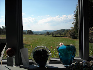
One of the first things you notice about Josh Simpson’s studio is the location. You look around and see green trees parting to show a beautiful view of the valley. It’s this view that drew Simpson to this spot. The other thing was the house also had a large barn where he could set up his studio. The first thing he points out is about a dozen roughly fifteen foot logs with sharpened ends resting on the beams above. He keeps these as a reminder that in 1971 he had to live in a canvas Tepee in an area of land he rented in Vermont. “I still think I might end up there again,” he says with a laugh.

As you keep walking he brings you to the hot shop. It lives up to its name. The first thing that hits you is the warmth. It’s not unbearable; it’s like being in a giant cozy blanket. It’s a huge room that’s lit up by the large windows that take up two walls showing off that beautiful view. Here the furnace runs 24/7 and has to be about 2100 to 2400 degrees Fahrenheit for working. As he opens the door the orange heat lets out a barely audible low hum and you feel the hot air flowing over you. You keep staring into the orange void even after he shuts the door.

In 1976 a teacher asked him to do a demonstration for a group of eighth graders. He happily agreed. Little did he know it meant for the next month every Wednesday he’d be doing a demonstration. He quickly learned the kids would get bored with vases and goblets. He found himself looking at the photo of Earth taken on the Apollo mission and decided to try making a world to show the kids how precious and fragile the earth is. He did this for six years before he started selling them.

Now they have been literally all over the globe, either in shows in New Zealand or Prague, or at the North Pole or the Great Wall of China from his Infinity Project.

But it’s here in this studio in Shelburne Massachusetts that they are born. You can see that this is almost a habit to him now as he goes through the process of making his globe. But it seems to have lost none of its magic for him. He talks enthusiastically as he shows you the stages of the process. First he puts a long metal rod into the rumbling furnace and pulls out, as if by magic, a glowing orange glob. He moves quickly to a corner in the hot shop where he coats this layer with silver. He lists the different compounds of silver as he goes and you can tell he enjoys the science of glass making almost as much as the physical work. He moves to a second furnace and puts a layer of black glass over the first layer. This will become the planet’s ocean. He moves to a table covered in small handmade pieces of glass cane that will become continents. With a fluid motion he dusts it with a pink glass dust and a fluttering piece of gold leaf. Then he scans his continents and picks a few. Once this process is finished he puts on a layer of clear glass and places his floating ship. He wouldn’t let me tell you how he does that, it’s one of his secrets.

Once he’s done, he hands it to his assistant Rick, whose regular job is as the local fire chief. Simpson jokes that if there’s ever a fire they let Rick take care of it. Rick forms the planet into its perfect spherical shape. He cups it in wooden shaping tools that are immersed in water. Simpson doesn’t hesitate to tell you it isn’t as easy as it looks.

Next they’re handed off to Simpson’s other assistant Erin who inspects the planet for imperfections. Then, with thick leather gloves and great care, she taps the globe at the base to break it free from the stick. She quickly puts it in a cooling furnace. You can tell it’s hot by her flinches.

Sorry if this post is a little long. Let me know if there's anything I can improve!

Saturday, September 25, 2010

About this Blog

This blog is for an art class I'm taking at my school called Visual Studies. We tour local artists studios, galleries, and collections. I will also use it for some more personal interests, such as comics. I hope you enjoy it!